
You know that feeling? The one where you get a sudden, brilliant idea for a website. Maybe it’s a portfolio, a dropshipping store, or a blog about vintage typewriters. The excitement hits you like a double shot of espresso. You rush to GoDaddy or Namecheap, buy the domain, install WordPress or open Webflow, and then…
You freeze.
Or, maybe you don’t freeze. Maybe you start dragging boxes around, picking colors, and writing headlines all at once. Three hours later, you look at your screen and realize you’ve built something that looks like a Myspace page from 2005. It’s messy, the navigation doesn’t make sense, and honestly? It’s kind of a disaster.
We’ve all been there. It’s the classic mistake of trying to put the roof on a house before you’ve even poured the foundation.
This is where website wireframing comes in.
It’s not the prettiest part of web design. It doesn’t involve flashy animations or cool typography. But if you skip it, you are basically setting your development budget (and your patience) on fire. Wireframing is the bridge between the chaos in your brain and a functional, live website.
If you’re ready to stop guessing and start planning, stick around. We’re going to walk through exactly how to do this and not just the theory, but the messy, real-world steps to getting it done.
Key Takeaways: Website Wireframing
Look, I know you’re busy. If you just want the “too long; didn’t read” version before we get into the weeds, here is what you need to know:
- Think “Blueprint,” Not “Painting”: A wireframe is a visual guide that represents the skeletal framework of a website. No colors, no photos just structure.
- It Saves Your Wallet: Fixing a mistake on a wireframe takes five minutes. Fixing a mistake in code can take five days (and cost five times as much).
- Content First, Design Later: It forces you to figure out what you want to say before you worry about what font to say it in.
- SEO Starts Here: Believe it or not, wireframing is a massive SEO tool. It’s where you map out your H1s, internal links, and site architecture.
- Don’t Overthink Tools: You can use fancy software like Figma, but a napkin and a sharpie work just as well to start.
What Is a Website Wireframe?
Let’s keep this simple.
Just Imagine you are hiring an architect to build your dream home. So obviously you wouldn’t start by picking out the curtains or deciding on the shade of beige for the living room walls, right? That would be insane.
First, you need a floor plan. You need to know where the bathroom is, how big the kitchen island is, and whether the front door opens into a hallway or straight into the living room.
A website wireframe is that floor plan.
It is a low-fidelity, monochromatic visual representation of your website’s interface. It focuses on space allocation, prioritization of content, available functionalities, and intended behaviors.

Basically, it answers three questions:
- Where does everything go? (Layout)
- What is most important? (Hierarchy)
- How does the user get from A to B? (Navigation)
The Blueprint Analogy
I use the house analogy a lot because it just works. When you look at a blueprint, you don’t see the paint color. You see lines, boxes, and measurements. A wireframe strips away the “distractions” of visual design like images, colors, or styling so you can focus purely on the structure.
If the structure is weak, the prettiest design in the world won’t save it. You can’t paint your way out of a bad layout.
Low-Fidelity vs. High-Fidelity Wireframes
Now, you might hear designers throwing around terms like “Lo-Fi” or “Hi-Fi.” They aren’t talking about music.
Low-Fidelity (Lo-Fi) Wireframes These are the rough drafts. The napkin sketches. The whiteboard scribbles. Lo-Fi wireframes are usually black and white, abstract, and rough. They use placeholders (like a box with an “X” through it) to represent images and “Lorem Ipsum” text for copy.

- When to use them: During brainstorming sessions or when you want to get an idea out of your head fast.
High-Fidelity (Hi-Fi) Wireframes These are a bit more polished. They are created using digital tools and might use actual grid systems and pixel-perfect spacing. They still don’t have the final colors or images, but they look much closer to a real website structure.
- When to use them: When you are pitching to a client or handing off the plan to a developer.
Here’s the thing: Don’t get hung up on making your wireframes look “pretty.” A pretty wireframe that has bad user experience (UX) is useless. A messy sketch that solves the user’s problem? That’s gold.
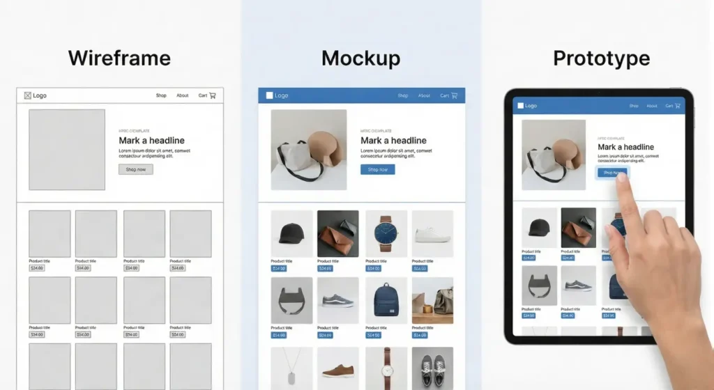
Wireframes vs. Mockups vs. Prototypes: What’s the Difference?
This is where people get confused. I see clients mix these terms up all the time, and honestly, it causes a lot of headaches down the road. “I sent you the wireframe!” they say, when what they actually sent was a fully colored design.
Let’s clear this up so you look like a pro. Think of it as the human body.
1. Wireframes (The Skeleton)
As we established, this is the bone structure. It holds everything up. It shows you that the leg bone connects to the hip bone.
- Focus: Structure, layout, content placement.
- Visuals: Black, white, gray lines.
- Interactivity: None (usually).
2. Mockups (The Skin)
Once the skeleton is approved, you add the skin. A Mockup is a static design that shows exactly what the final website will look like. This is where you bring in your brand identity like colors, your typography, your photos, and your shadows. And its great for your Brand SEO
- Focus: Look and feel, brand identity, aesthetics.
- Visuals: Full color, high detail.
- Interactivity: Still none. It’s just a picture of the website.
3. Prototypes (The Movement)
Now, make that body walk. A Prototype is a simulation of the website. It might look like a wireframe or a mockup, but the key difference is that it’s clickable. You can click a button and it actually takes you to the next page. Dropdown menus drop down. Hover states work.
- Focus: User flow, functionality, testing interactions.
- Visuals: Can be Lo-Fi or Hi-Fi.
- Interactivity: Yes!
Why does this distinction matter? Because if you try to build a Prototype before you have agreed on the Wireframe, you are going to waste dozens of hours. Imagine coding a complex dropdown menu only for the client to say, “Actually, I don’t want a menu there at all.”
Painful, right? That’s why we stick to the process: Wireframe first. Mockup second. Prototype third.
Why Making a Wireframe Is Critical for SEO
Okay, stick with me here. This is the part that most “design” articles miss completely.
Usually, people think SEO (Search Engine Optimization) happens after the site is built. You know, you hire some agency to sprinkle keywords into your blog posts and hope for the best.
But here is the truth: Real SEO happens in the wireframing stage.
If your site structure is messy, Google’s bots (crawlers) can’t navigate it. If the crawlers can’t navigate it, they can’t index it. And if they can’t index it, you don’t exist.
Planning Keyword Hierarchy, Distribution, and Density
When you are drawing those boxes on your wireframe, you aren’t just placing text; you are defining the hierarchy of information.
- The H1 Tag: In your wireframe, you’ll define the biggest headline on the page. That’s your H1. You need to know right now what your primary keyword is for that spot.
- The H2s and H3s: By sketching out sub-sections, you are planning your content clusters. You are effectively telling Google, “This page covers Topic A, composed of sub-topic B and C.”
If you wait until the design is finished to think about this, you might realize the fancy design you picked doesn’t have room for the 500 words of content you need to rank. Then you have to break the design to cram the text in. It’s a mess.
Optimizing Site Architecture
Google loves a logical structure. It wants to see a clear path:
- Home Page -> Category Page -> Product Page
When you wireframe, you are literally drawing this map. You are deciding, “Okay, the ‘About’ link goes in the footer, but the ‘Services’ link needs to be in the main sticky header.”
This is called Information Architecture (IA). Good IA keeps users on your site longer (which boosts rankings) and helps Google understand the relationship between your pages.
Enhancing User Experience (UX)
You might be thinking, “What does UX have to do with SEO?”
Everything. Google’s “Core Web Vitals” update made user experience a direct Google ranking factor. If users land on your site, get confused by the layout, and leave (bounce) within 10 seconds, Google takes note. They think, “This result wasn’t helpful,” and they drop your ranking.
Wireframing lets you spot those UX nightmares early. You might notice, “Hey, on mobile, this button is too close to that image. People are going to fat-finger it.” You fix it in the sketch, save the user the frustration, and keep your bounce rate low.
How to Plan Your Site Before You Build (Step-by-Step Guide)
Alright, enough theory. You know what a wireframe is, and you know why you need one. Now, let’s roll up our sleeves and actually build the thing.
I’m going to walk you through the exact process I use. Whether you are building a personal blog or a massive e-commerce store for a client, these steps remain the same.
1. Research and Gather Information
You can’t design for someone you don’t understand.
Before you draw a single line, you need to get inside the head of your user. Who are they? What are they looking for? And most importantly, what is annoying them about their current solution?
If you skip this step, you are just making pretty shapes in the dark.
Ask yourself these questions:
- Who is the target audience? A 19-year-old looking for limited-edition sneakers has very different needs than a 55-year-old looking for life insurance. The sneaker kid wants big images and fast checkout. The insurance buyer wants trust badges, phone numbers, and clear explanations.
- What are the competitors doing? Go look at the top three sites in your niche. What do their layouts look like? Do they all have the navigation on the left? If everyone does it one way, there’s usually a reason. You don’t always have to reinvent the wheel.
Pro Tip: Create a “Mood Board” (or just a folder on your desktop) of screenshots from sites you like. Not for the colors, but for the layout. “Oh, I like how they handled the testimonials section here.” Save that.
2. Define Goals and Leverage User Flows
This is where things get logical. You need to map out the journey you want the user to take.
We call this a User Flow.
Think of it like a flowchart.
- Start: User lands on Home Page.
- Action: User clicks “Shop Men’s Boots.”
- Next: User sees Category Page. Filter by size.
- Action: User clicks a product.
- Goal: Add to Cart -> Checkout.
If you don’t map this out, you might end up designing a beautiful homepage that leads… nowhere. Or worse, you bury the “Buy Now” button under three layers of menus.
Try this exercise: Write down the Primary Goal of your website. Wait you can also checkout How to Design a Website for Beginners and trust me it will helps you a lot. So Is it to get an email sign-up? To sell a product? To get them to read an article? Now, working backward from that goal, what steps does the user need to take to get there? Design your wireframe to grease the wheels for that specific path.
3. Draft the Initial Wireframe (The “Messy” Phase)
Please, step away from the computer.
I mean it. Close the laptop. Grab a notebook, a whiteboard, or even the back of a napkin.
The problem with starting digitally is that you get distracted by perfection. You start worrying if your box is 200 pixels wide or 210 pixels wide. Who cares? At this stage, we just want to know if the box should exist.
Sketching allows you to fail faster. You can draw a header, realize it looks crowded, cross it out, and redraw it in ten seconds. If you were doing that in software, it would take five minutes of dragging and dropping.
What to include in your sketch:
- Header: Logo, Navigation, Search bar.
- Hero Section: The main headline and the primary image area.
- Body Content: Blocks of text (just scribble lines to represent text).
- Footer: Copyright, social links, secondary links.
Don’t erase. Just iterate. Draw version 1, hate it, move to a fresh page, draw version 2.
4. Zero in on (and Test) Your Critical Conversion Points
Once you have a rough sketch, look at it with a critical eye. Where are your Calls to Action (CTAs)?
A website without a clear CTA is just a brochure that nobody reads.
In your wireframe, your CTA buttons should be the most obvious thing on the page. Even in a black-and-white sketch, you can use contrast (like a solid black button against a white background) to show importance.
The “Squint Test” Here is a classic designer trick: Look at your wireframe and squint your eyes until everything goes blurry. What stands out? If the first thing you see is the “About Us” link, you have failed. The first thing you should see (even when blurry) is the value proposition or the “Get Started” button.
5. Get Feedback
You’ve been staring at this wireframe for hours. You have tunnel vision. You need a fresh pair of eyes.
Show your wireframe to someone else. Ideally, show it to someone who fits your target audience. But honestly? Even showing it to your mom or your roommate helps.
Watch them, don’t help them. Hand them the sketch (or the digital file) and give them a task. Say, “Okay, imagine you want to find the contact page. Where would you click?”
Then, and this is the hard part – shut up.
Don’t say, “Oh, it’s right there in the corner.” Watch them struggle. If they can’t find it in three seconds, your layout is wrong. It doesn’t matter if you think it’s obvious. If the user is confused, the design is broken.
6. Test, Iterate, and Test Again
Take that feedback and go back to the drawing board. Maybe you need to move the navigation. Maybe the headlines are too small.
This cycle of Create -> Test -> Fix is the heartbeat of good design.
By the time you move to high-fidelity design (adding colors and photos), you should be 100% confident that the structure works. You shouldn’t be wondering, “Does this layout make sense?” You should know it does, because you tested it.
Top Tools for Website Wireframing (2025)
“Okay,” you’re saying. “I’m sold. But what software should I use?”
There are a million tools out there, but you really only need to know a few.
1. Pen and Paper (The MVP) I’m serious. It’s free, it doesn’t crash, and it has infinite battery life. Start here. Always.
2. Figma (The Industry Standard) If you want to get a job in web design, learn Figma. It’s browser-based, collaborative (so you and your client can look at it at the same time), and powerful. You can do everything from rough wireframes to full high-fidelity prototypes in it. Plus, it has a generous free tier.
3. Balsamiq (The Digital Napkin) Balsamiq is great because it forces you to be low-fidelity. The software literally makes your lines look like squiggly marker sketches. This is brilliant because it stops clients from saying, “I don’t like that shade of blue.” It reminds everyone: This is just a sketch.
4. Miro (The Whiteboard) If you are brainstorming with a remote team, Miro is fantastic. It’s a giant digital whiteboard where everyone can stick post-it notes, draw arrows, and drop in screenshot references.
Conclusion
We’ve covered a lot of ground today.
We went from the definition of wireframing (the blueprint) to the deep SEO implications, and finally, the nitty-gritty steps of how to sketch one out.
Here is the thing: It is tempting to skip this step. It really is. When you are excited about a new project, you want to see the shiny final product now. You want to pick fonts. You want to see the logo on the screen.
But trust me on this every hour you spend wireframing saves you ten hours of coding and frustration later.
Wireframing gives you clarity. It gives you a roadmap. And most importantly, it gives you the confidence to build your site knowing that the foundation is solid.
So, don’t open WordPress yet. Don’t buy that premium theme yet.
Grab a piece of paper. Grab a pen. And start drawing your blueprint.
Your future self will thank you.