I was looking at some stats the other day, and it’s actually wild. I mean, Gartner is predicting that nearly 75% of all digital interactions will be AI-powered by the end of this year. Think about that for a second.
We aren’t just moving pixels around anymore. We are architecting experiences that literally learn, shift, and talk back.
If you feel like the ground is moving under your feet, honestly, you’re right. It is. But that’s also why being a web designer or developer right now is the most exciting job on the planet.
Why staying updated isn’t just “good advice” anymore
In 2026, a “pretty” website is the bare minimum. If your interface doesn’t anticipate what a user wants, it’s already obsolete. Businesses are no longer just looking for a digital brochure but they’re looking for high-performance engines that drive engagement, and for us as creators, that means understanding the “why” behind every button placement.
If we don’t stay ahead of these shifts, we aren’t just falling behind on trends and we’re leaving money and user trust on the table.
This guide UI design in 2026 is our deep-dive (and yes, I know, everyone says “deep dive,” but we’re actually going to look at the gears here) into the trends, tools, and UX standards you need to build interfaces that don’t just look “2026” and they rank high in user satisfaction and, crucially, in search engines.
Whether you’re just starting out or you’ve been coding since the days of jQuery, let’s look at how we’re going to navigate this new era together.
Key Trends Shaping UI Design in 2026
So, where is all of this actually going? If you’ve spent any time on social media lately, you’ve probably seen some of those “future of tech” videos that look like they’re straight out of a sci-fi movie.
But here’s the thing is that it’s not just concept art anymore. We’re living it. For us at Zumeirah, 2026 feels like the year the training wheels finally came off for AI and immersive tech.
1. AI-Driven Dynamic Interfaces
Honestly, the days of “one-size-fits-all” design are basically dead. You know how you used to design a landing page and hope it worked for everyone? Yeah, that doesn’t fly anymore. Now, we’re looking at interfaces that actually think while the user is using them.
- Explainable AI (XAI): We’ve all been there like an app makes a weird suggestion and you’re just sitting there like, “Why?” In 2026, trust is the biggest currency. Interfaces now explain themselves. Instead of just a random recommendation, you’ll see things like, “Hey, I’m suggesting this layout because you usually check your analytics first on Monday mornings.” It feels less like a black box and more like a helpful assistant.
- Agentic UX: This is a big one. We’re moving from simple chatbots to full-on “agents” that can actually do things for you. Think of it as a human-agent ecosystem. The UI generates itself on the fly based on what the agent needs to show you to get a task done.
- Real-time Personalization:
- E-commerce: Imagine a store that changes its entire navigation based on whether you’re a “window shopper” or someone who knows exactly what they want.
- Healthcare: Apps that simplify their layout when they detect high stress levels in a user’s voice or touch patterns.
Expert Tip: Don’t just let the AI run wild. You’ve got to integrate it ethically. Always test for bias and if your AI-driven UI starts favoring one demographic over another, you’re going to lose user trust faster than a 404 error on a launch day.
2. Immersive and Mixed Reality Experiences
I remember when “Mixed Reality” (XR) felt like something only gamers cared about. But now? It’s everywhere. With the new headsets and glasses that dropped this year, our everyday apps are jumping off the screen and into the real world.
- Everyday XR: We’re seeing more and more web apps using WebXR to let users “place” digital objects in their physical room. It’s not just for furniture anymore; it’s for collaborative workspaces and data visualization.
- Voice & Vision Based Interfaces (VBI): Typing is honestly becoming a secondary input. Between voice-based interactions and eye-tracking, we’re designing for hands-free navigation.
- The “Squishy” Evolution: Remember when everything was flat? Boring, right? Well, 2026 is the year of Tactile UI. We’re seeing a mix of glassmorphism and what I like to call “squishy” UIs like buttons that actually deform and bounce back when you “touch” them in a spatial environment.
- Micro-interactions: It’s the little things, you know? Kinetic typography where the letters dance as you scroll, or haptic feedback that makes a digital button feel like real plastic.
Expert Tip: Accessibility isn’t optional in XR. If your “floating” menu isn’t compatible with screen readers or gesture-alternatives, you’re locking out a huge chunk of your audience. Keep it inclusive!
3. Maximalism and Retro Aesthetics
You might think that with all this high-tech stuff, everything would look super clean and clinical. Nope. We’re actually seeing a massive swing back toward Maximalism. It’s like we all got bored of those “perfect” white-space-heavy designs and decided to have some fun again.
- Tactile Maximalism: Think bold textures, heavy layers, and “imperfect” elements. There’s this trend called Texture Check where the design looks so real you almost want to reach out and feel the paper grain or the chrome finish.
- Reality Warp: This is all about blurring the lines. Using AI to create surreal, “glitchy,” or dreamy visuals that catch the eye. It’s a bit weird, sure, but in a sea of boring websites, weird is what gets you remembered.
- Retro & Brutalism: We’re seeing a lot of “Notes App Chic” and raw, blocky layouts. It’s nostalgic, but with a 2026 polish. It’s about being authentic and a little bit messy.
Minimalism vs. Maximalism: The 2026 Breakdown
| Aspect | Minimalism (Pre-2026) | Maximalism (2026 Trend) |
| Visual Style | Clean, simple lines | Bold textures, layers, “Reality Warp” |
| User Engagement | Functional efficiency | Emotional, immersive storytelling |
| Examples | Standard flat SaaS dashboards | Squishy UIs, kinetic type, “Texture Check” |
| Pros | Faster load times (usually) | Higher retention & “vibe” connection |
| Cons | Can feel a bit “soul-less” | Risk of overwhelming the user |
4. Sustainability and Ethical Design
Let’s talk about something that actually matters for the long haul: the planet. I know, “green design” sounds like a buzzword, but in 2026, it’s actually a requirement.
- Eco-friendly Interfaces: We’re moving toward low-energy designs. Dark mode isn’t just a “cool feature” anymore but it’s the standard because OLED screens save a ton of power when they aren’t blasting white pixels.
- Zero UI: This is the ultimate goal. Interfaces that are so minimal they almost disappear. Less clutter = less data transfer = a smaller carbon footprint.
- Neurodiversity: We’re finally designing for everyone. This means interfaces that can be adjusted for different cognitive needs reducing motion for some, increasing contrast for others, and keeping things predictable.
Expert Tip: Use tools to audit your carbon footprint. Just like you check your site speed, you should be checking how much energy your site is “burning” every time someone visits.
Honestly, it’s a lot to take in, right? But that’s the beauty of it. We’re moving away from being “pixel pushers” and becoming “experience architects.”
Read : Design a Website for Beginners with 6 Proven Steps
Essential Tools for UI Design in 2026
If you tried to use the same toolkit from three years ago, you’d probably feel like you were trying to build a skyscraper with a plastic hammer. The shift hasn’t just been about “new versions” of software and it’s about how these tools now practically do the heavy lifting for us. We’ve moved from tools that just sit there to tools that actually help us think.
1. Prototyping and Wireframing Tools
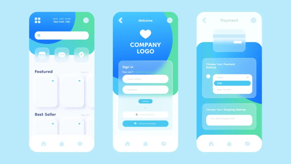
Even with all the AI hype, you still need a home base. For most of us, that’s still Figma. But let’s be real: Figma in 2026 is a different beast.
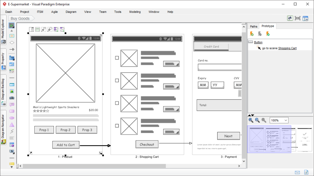
- Figma & Tokens Studio: It’s not just about drawing boxes anymore. With Tokens Studio, we’re building design systems that can change an entire app’s look in seconds. If the client suddenly decides they hate “brand blue” and want “sunset orange,” you aren’t clicking through 500 layers. You’re changing one variable.
- Visily & UXPin: If you’re stuck on a blank canvas, these are life-savers. Visily lets you take a screenshot of a site you like and bam, it turns it into an editable wireframe. UXPin is still the king for when you need your prototype to actually act like real code, with variables and logic that don’t break when you click them.
- Sketch & Adobe XD: They’re still around, of course. Sketch is still that polished, Mac-only experience that some purists (myself included, sometimes) just love for its precision. Adobe XD is great if you’re already paying for the full Creative Cloud suite and need that tight integration with Photoshop.
Expert Tip: If you haven’t mastered Figma’s Dev Mode yet, make that your goal for this weekend. It’s the bridge that stops developers from asking you “what’s the padding here?” for the tenth time. It basically hands them the CSS on a silver platter.
2. AI-Powered Design Assistants
You know what? I used to be worried that AI would take my job, but now I’m just happy it’s taking the boring parts of it. We’re seeing the rise of Agentic AI Co-Pilots is basically a little design buddy that sits in your toolbar.
- Google Stitch & Galileo AI: These tools are wild. You can literally type “I need a dashboard for a pet grooming business in a brutalist style” and they’ll spit out a high-fidelity starting point. Is it perfect? No. But is it better than staring at a white screen for two hours? Absolutely.
- Predictive Usability (Maze & Lyssna): This is where it gets really “future-tech.” Tools like Maze now use AI to predict where users will click before you even send it to a real person. It’s like having a crystal ball for your UX.
- Balsamiq & Zeplin: Sometimes you just want to keep it simple. Balsamiq is still the go-to for “lo-fi” thoughts where you don’t want to get distracted by colors. Zeplin remains a solid choice for teams that want a super organized handoff that isn’t just a messy Figma file.
Expert Tip: Always keep a human in the loop. AI is great at speed, but it has no “soul.” It can give you a perfect layout that feels completely empty. You’re the one who adds the “vibe.”
3. Advanced Collaboration and Coding Tools
The line between “designer” and “developer” is getting so thin you can barely see it.
- Storybook: If you aren’t using Storybook to manage your components, you’re making life harder for your dev team. It’s basically a library where every button and form field lives in its own little world.
- Replit Agent & Emergent: These are the new kids on the block. They allow you to take a design and honestly, it feels like magic turn it into actual, working React or Vue code. We’re talking about “vibe coding” where you describe the function and the tool builds the frontend and backend.
- Axure RP: For the really complex stuff think banking apps or massive enterprise tools Axure is still the heavyweight champ for interactive prototyping.

Top UI Design Tools in 2026 Comparison
| Tool | Key Features | Best For | Pricing (2026 Est.) |
| Figma | Real-time collab, Dev Mode, AI Make | Teams, Prototyping | Free / $15/mo per seat |
| Adobe XD | Voice prototyping, CC integration | Adobe Suite users | $33/mo (Standalone) |
| Visily | Screenshot-to-Design, AI Wireframes | Rapid ideation | Free / $11/mo |
| Maze | Predictive heatmaps, AI testing | UX Research | Free / $50/mo |
| Framer | Design-to-Live-Site, Motion | Marketing & Portfolios | Free / $15/mo |
It’s a lot of software, right? But here’s the secret: you don’t need to know all of them. Pick one for design (Figma), one for testing (Maze), and one for handoff (Storybook), and you’re already ahead of 90% of the people out there.
Evolving UX Standards in 2026
So, we’ve got our cool trends and our shiny new tools. But here’s the thing and honestly, I see people get this wrong all the time like a pretty interface that doesn’t follow the “rules of the road” is basically just a digital paperweight. In 2026, the standards aren’t just about making things easy to click. It’s about making them feel right.
1. Core UX Principles (The Classics Still Matter)
Even with AI doing the heavy lifting, the way our brains process information hasn’t changed much since the 90s. We still rely on those timeless psychological laws that make an interface feel intuitive instead of a puzzle.
- Jakob’s Law: You know why most websites look kind of similar? It’s because users spend most of their time on other sites. If you try to reinvent the wheel by putting your navigation menu in the bottom-right corner, you’re just going to annoy people. Stick to the patterns they know.
- Fitts’s Law & Hick’s Law: Basically, keep the big, important buttons easy to hit, and don’t give people 50 options when 3 will do. If you’ve ever felt “analysis paralysis” while trying to pick a Netflix show, you’ve experienced a Hick’s Law failure.
- The Hierarchy of Needs: A user needs to be able to finish their task before they care about how nice your glassmorphism looks. Function first, always.
Expert Tip: I always tell people to keep a tab open for the Nielsen Norman Group’s 10 Usability Heuristics. Even in 2026, those ten rules are basically the UX Bible. If your design fails one of those, it’s going to fail the user.
2. AI and Automation Standards
This is the “new” stuff. Since we’re now dealing with interfaces that can literally rewrite themselves on the fly, we need new guardrails.
- Generative UI (GenUI): In 2026, we’re seeing “intent-based” layouts. If the system thinks you’re trying to book a flight, the UI might shift to show you a calendar and recent destinations immediately. But and here’s the catch like if the UI moves too much, it gets disorienting. We have to balance that “magic” with a sense of stability.
- Explainable AI (XAI): This is non-negotiable now. If an AI suggests a specific workflow, the interface needs to have a little “why” button or tooltip. People don’t like black boxes; they like partners.
- Multimodal Consistency: Whether a user is talking to your app, typing, or using hand gestures in a spatial environment, the experience needs to feel like it’s coming from the same “brand voice.”
Expert Tip: Don’t just trust the AI’s “vibe.” Run A/B tests specifically on your AI-generated layouts. Sometimes what the algorithm thinks is efficient actually feels cold or confusing to a real human.
3. Accessibility and Inclusivity (Beyond the Checklist)
I’m really glad we’ve finally moved past “just add alt text.” In 2026, accessibility is about Neurodiversity and Functional Outcomes. We’ve shifted from the old WCAG 2.2 to the more flexible WCAG 3.0 (often called Silver or Gold standards).
- The Bronze, Silver, Gold Scale: Unlike the old “Pass/Fail” system, WCAG 3.0 uses a scoring model. It’s more about the actual user experience than just checking a technical box.
- Designing for ADHD and Dyslexia: This means “Focus Modes” that strip away the junk, and using dyslexia-friendly typography options. It’s about giving the user control over their sensory environment.
- Zero UI & Minimalist Defaults: For a lot of users, the best UI is no UI. Voice commands and haptics allow people with motor impairments or visual challenges to navigate just as fast as anyone else.
UX Standards Checklist for 2026
| Standard | Description | Implementation Tip |
| WCAG 3.0 Score | Focuses on functional user outcomes. | Aim for at least a “Silver” rating for Zumeirah projects. |
| Personalization | AI-driven adaptive experiences. | Always give the user an “Undo” or “Reset to Default” button. |
| Sustainability | Low-carbon, energy-efficient assets. | Use vector graphics and optimized “WebP 2” images. |
| Ethical AI | Bias-free and transparent algorithms. | Regularly audit your training data for inclusivity. |
4. How to Actually Implement This
You can’t just read about this and be done. You’ve got to build it into your workflow. At Zumeirah, we’re big on “Research-First” design.
- Continuous Discovery: Don’t just do research at the start. Use tools like Lyssna or Userlytics to keep testing your ideas every single week.
- The Designer-Developer Bridge: In 2026, if you’re a designer who doesn’t understand a bit of code (or a dev who doesn’t get “the vibe”), you’re going to struggle. We use Storybook to keep everyone on the same page.
Expert Tip: If you’re serious about this, look into getting certified. Courses from the Interaction Design Foundation (IxDF) or the Google UX Professional Certificate are still the gold standard for keeping your skills sharp and your resume looking fresh.
Honestly, it feels like a lot, doesn’t it? But here’s the secret: if you just focus on being empathetic to the person on the other side of the screen, most of these standards will start to feel like second nature.
Read : Best 10 Web Design Trends for 2026 | Future of UI/UX & AI
Looking Ahead: The Future is Yours to Build
You know, looking back at everything we’ve talked about, it’s easy to feel a bit overwhelmed. I get it. One minute we’re talking about “squishy” buttons and the next we’re debating the ethical implications of agentic AI.
But if you take away just one thing from this whole guide, let it be this: 2026 isn’t about the technology; it’s about the person using it.
We’ve seen how AI is moving from a “cool trick” to a genuine partner in the design process. We’ve looked at tools like Figma and Visily that are basically giving us superpowers.
And most importantly, we’ve hammered home the idea that accessibility and sustainability aren’t just checkboxes but they are the foundation of a better internet.
What’s your first move?
Honestly, you don’t need to master everything at once. Maybe tomorrow you just play around with a new variable font, or you spend twenty minutes auditing a landing page for neurodiversity. Those small shifts? That’s where the real growth happens.
I’d love to hear what you’re working on. Are you leaning into that “Tactile Maximalism” vibe, or are you keeping it clean with a “Calm UI”? Whether you’ve found a new tool that’s a total game-changer or you’re struggling to get your head around spatial design, we’re all in this “2026 experiment” together.
The Final Word
By adopting these trends, tools, and standards, your web designs in 2026 won’t just look the part also they’ll actually work. They’ll engage users on a deeper level, build lasting trust, and yes, they’ll dominate those search rankings because you’re providing the kind of value that Google’s algorithms are finally smart enough to recognize.
The era of “static” web design is over. Welcome to the era of the Zumeirah-standard interface. Now, go out there and build something that makes people stop and say, “Wait, how did they do that?”
Frequently Asked Questions: UI Design in 2026
Honestly, I know we just covered a ton of ground. You’ve probably got a few specific questions swirling around, so let’s knock out the big ones that keep coming up in the design community this year.
Do I seriously need to learn how to code to be a UI designer in 2026?
You don’t need to be a Senior Full-Stack Engineer, but the “barrier” between design and code has basically vanished. With tools like UXPilot AI and Figma’s Dev Mode, you need to understand how code works and things like Flexbox, CSS Grid, and design tokens.
If you can speak the language of developers, you become ten times more valuable to a team. You don’t have to build the whole engine, but you definitely need to know how to look under the hood.
Read : Website Wireframing: Plan Your Site Before Building in 2026
Is AI actually going to replace my job as a designer?
I get asked this at least once a week. The short answer? No. The longer answer? AI is replacing the boring parts of your job. It can generate 50 variations of a button in three seconds, but it can’t understand the emotional nuance of a brand or the weird, unpredictable way a human user thinks.
Think of AI as your high-speed intern. It does the grunt work so you can focus on the “Big Idea” and the strategy.
What is the biggest shift in UX standards this year?
It’s definitely the move toward Explainable AI (XAI) and Neuro-Inclusion. We’ve stopped treating accessibility as a “nice-to-have” and started realizing that a design that works for someone with ADHD or dyslexia actually works better for everyone. If your interface feels “calm” and predictable, you’re winning in 2026.
Which tool should I start with if I’m a total beginner?
Honestly, start with Figma. It’s still the industry standard for a reason. But once you get the hang of it, play around with an AI-first tool like Visily or UXPin. It’ll give you a feel for how modern workflows are moving toward automation. Just don’t get too caught up in the tool focus on the principles we talked about, like Fitts’s Law and hierarchy.
How do I make my UI “sustainable”?
It sounds like a weird concept, right? But digital products have a carbon footprint. In 2026, sustainable UI means optimizing your assets so they load faster and use less energy. Think dark mode by default (which saves OLED battery life) and using vector graphics instead of massive, high-res photos. It’s better for the planet and, honestly, it’s better for your site’s speed.